

Mangia is a concept, and we say so.
Mangia is one of three self-initiated projects, built to show our method in full rather than describe it. There is no restaurant and no client, so you will find no covers counted, no reviews and no testimonials on this page. What you will find is the work itself: the thinking, the system and the craft, presented exactly as we would build it for you.
Great cooking, dressed as a tourist trap.
Picture a Dalston trattoria, busy most nights, the kind of room regulars guard like a secret. The kitchen is the real thing. But nobody eats before they read the menu, and the menu was telling them to keep walking.
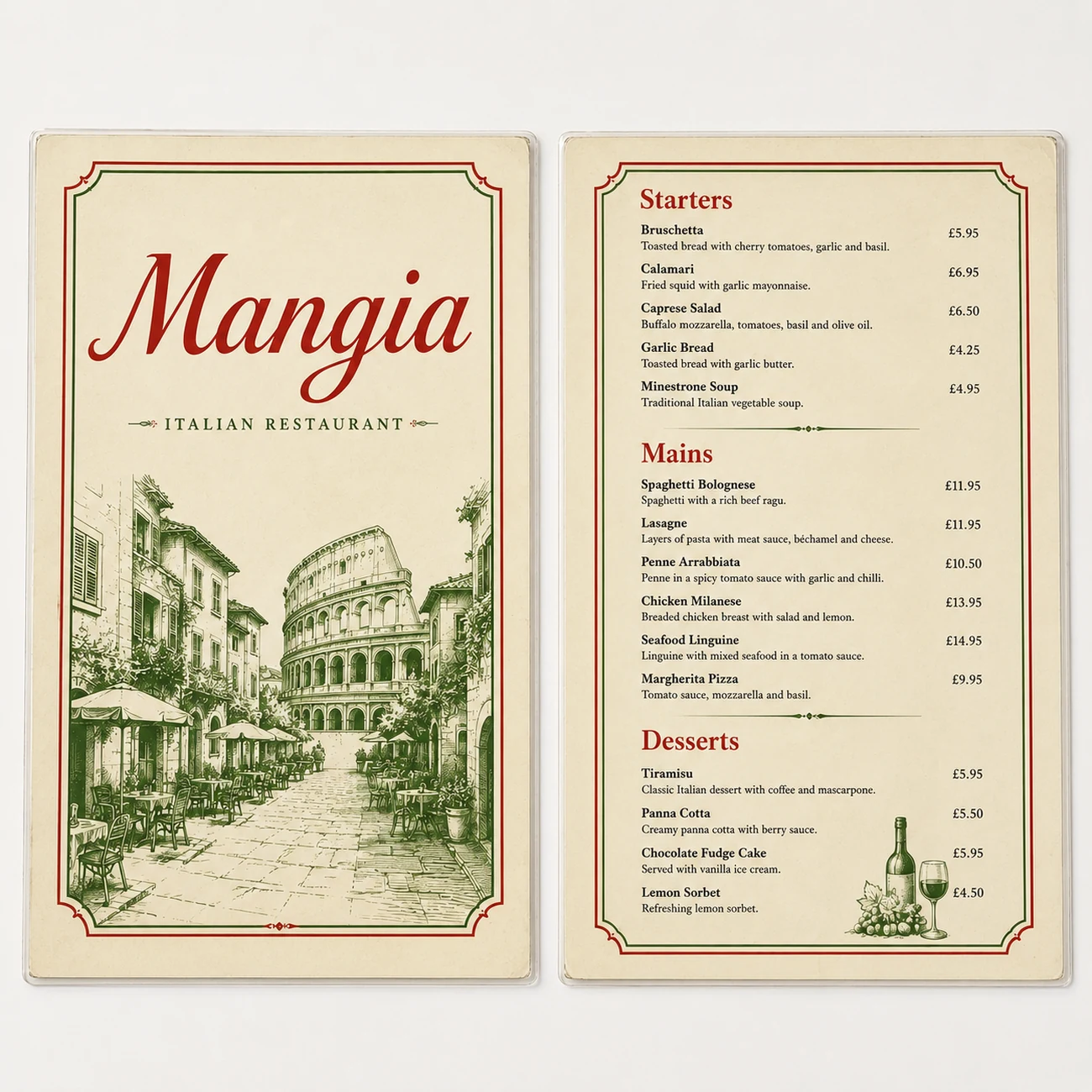
- 01A red italic logo and a laminated menu: warm enough, and identical to every other room on the street.
- 02A Colosseum on the cover and Times New Roman inside. Borrowed history doing the work the kitchen should.
- 03A feed of plates shot under flash: appetising, and completely interchangeable.
Make the brand as loud as the room.
Three moves, all addition in spirit.
Find the volume
The room is loud, warm and full. The brand was none of those things. Match the identity to the experience people already have the moment they sit down.
Commit to a character
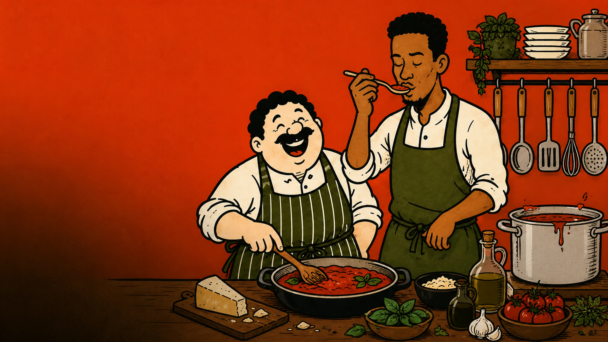
A laughing chef, a bowl held overhead, a wordmark that shouts. One mascot drawn with conviction is worth more than a stock photograph of pasta.
Say it like you mean it
Burnt orange, olive, a heavy condensed type borrowed from old Italian street bills, hand-lettered where it counts. Confidence you can read from across the street.
One word, one grin.
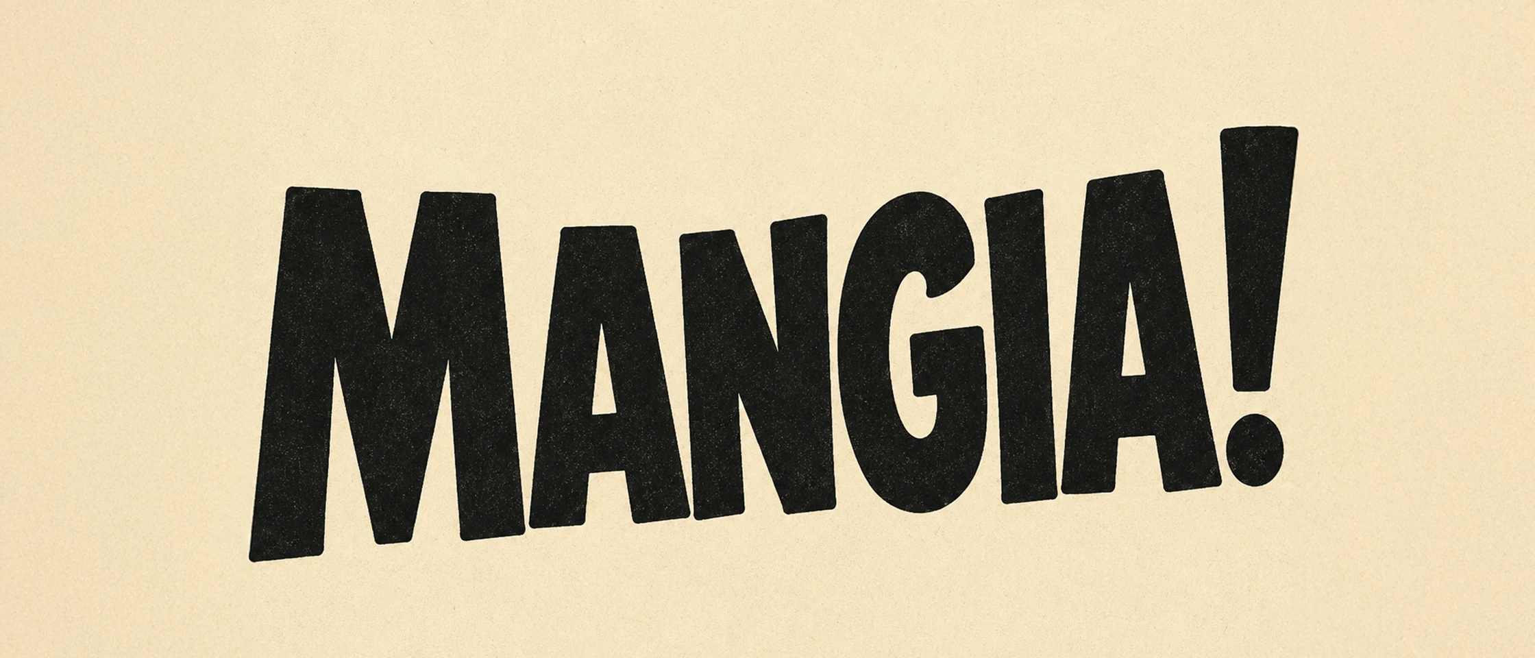 the wordmark · built to be shouted
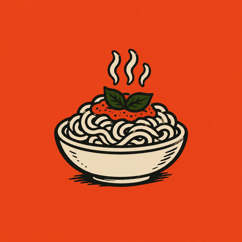 the mark · a steaming bowl
The apologetic italic became a heavy condensed sans. The stock plate became a mascot with a name and a grin. Burnt orange carries the brand, olive holds it down, and the line under the logo says exactly what the place is about.
- wordmark
MANGIA, set heavy and loud. The exclamation is optional once the chef is doing the smiling.
- mark
A steaming bowl of pasta, as direct as the name. The laughing chef carries the warmth across the rest of the brand.
- palette
Burnt orange, olive, cream, near-black. Loud on purpose.
- voice
Warm, direct, a little cheeky. We cook what we love. Come hungry.
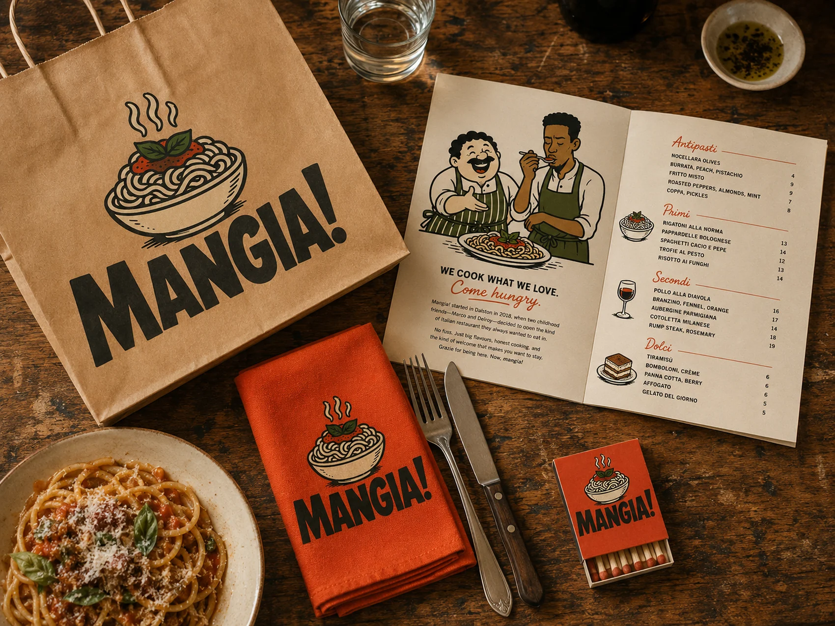
A world as warm as the welcome.
Nothing here is quiet.
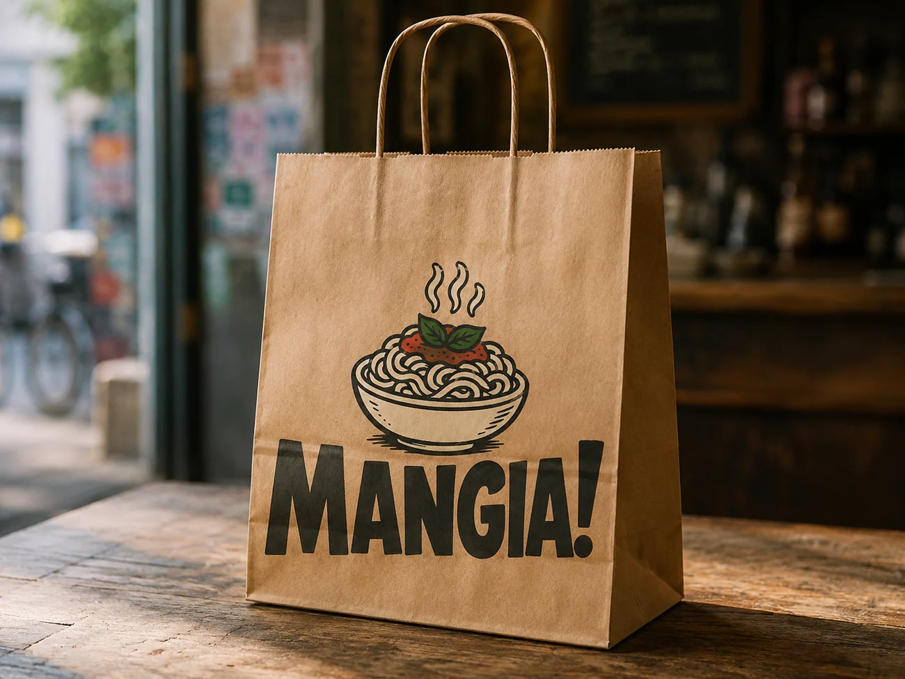
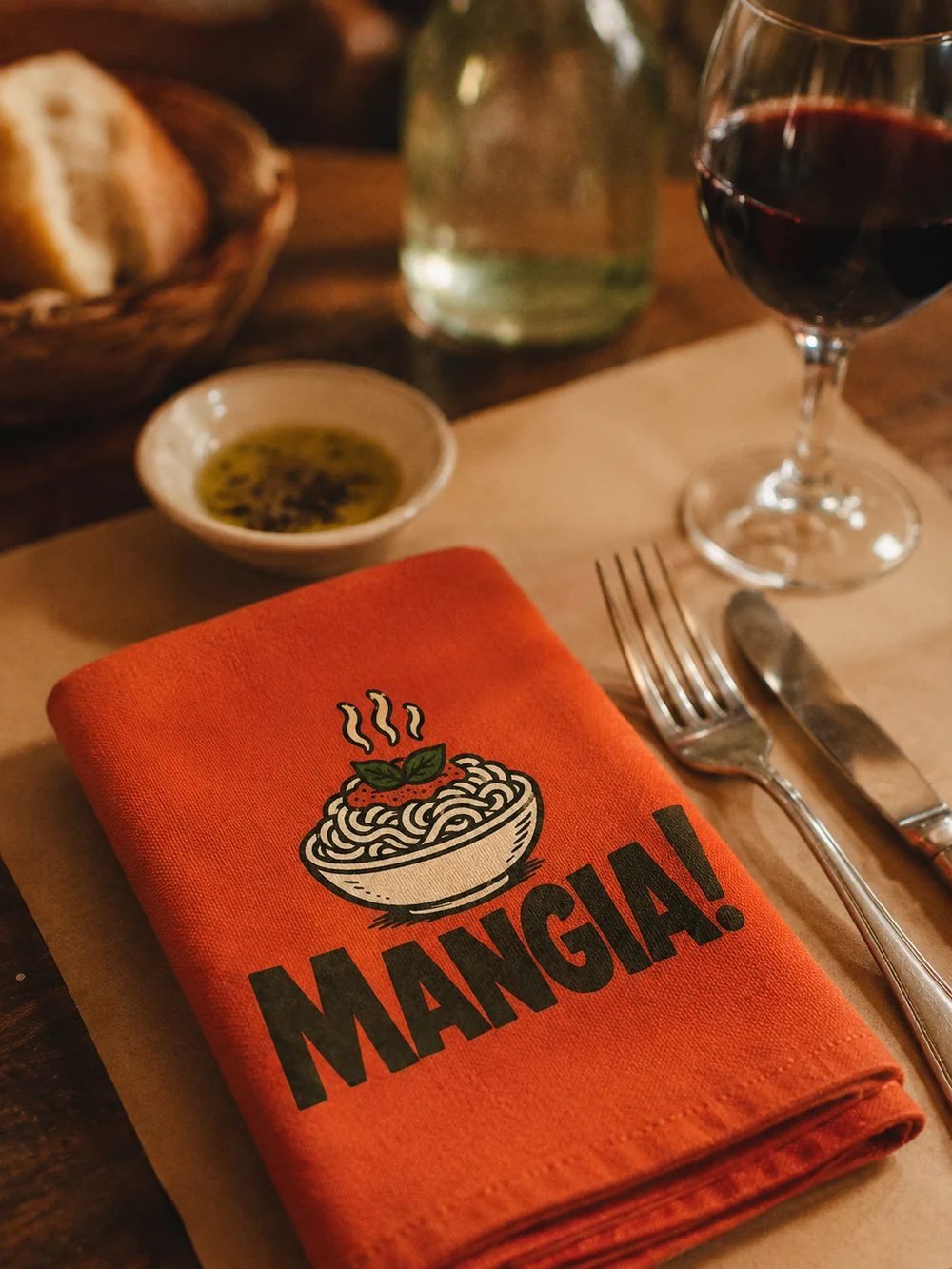
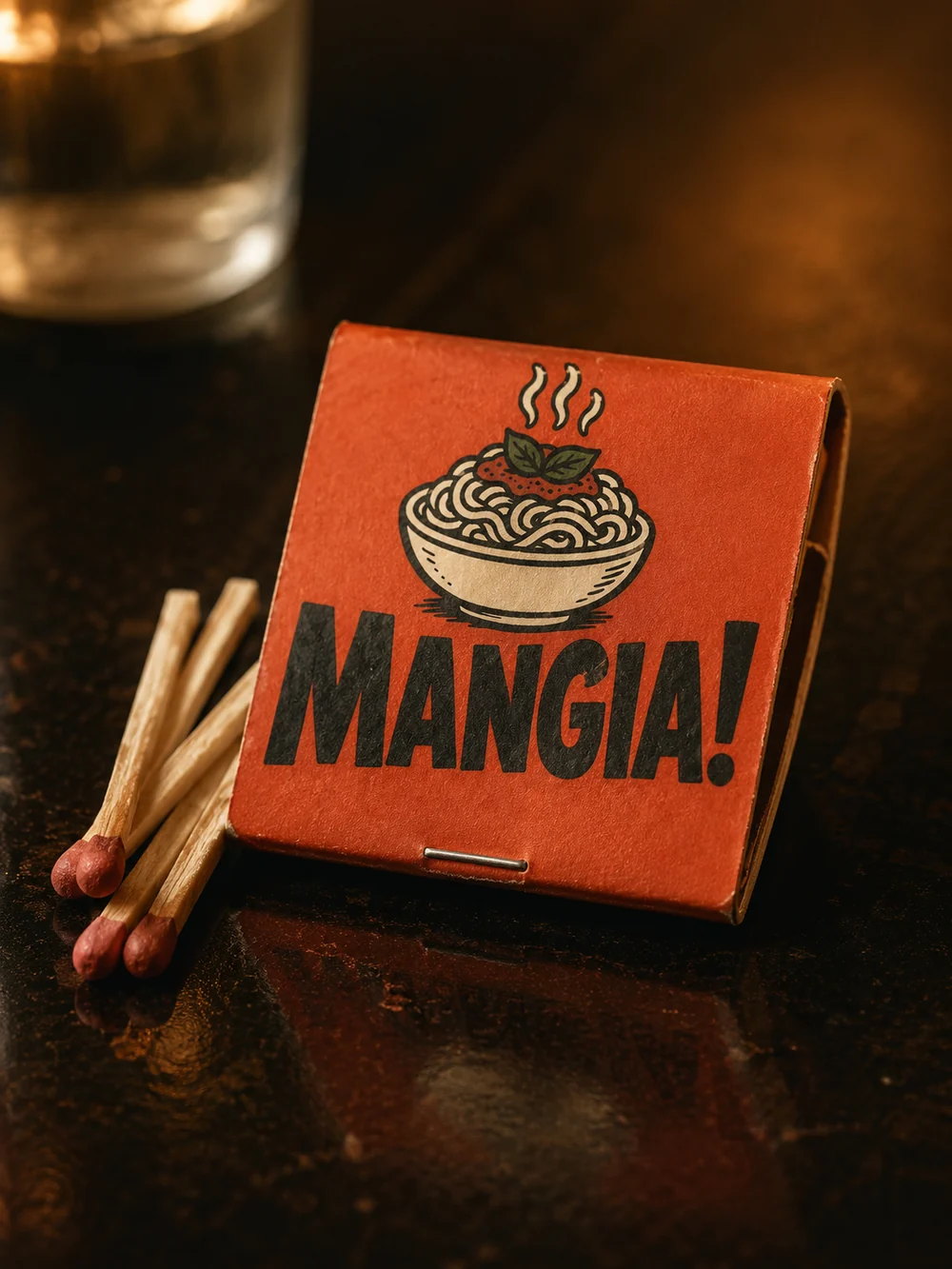
The argument, settled side by side.
The rebrand, applied end to end: the new site to scroll, then the same Instagram account a world apart in taste.
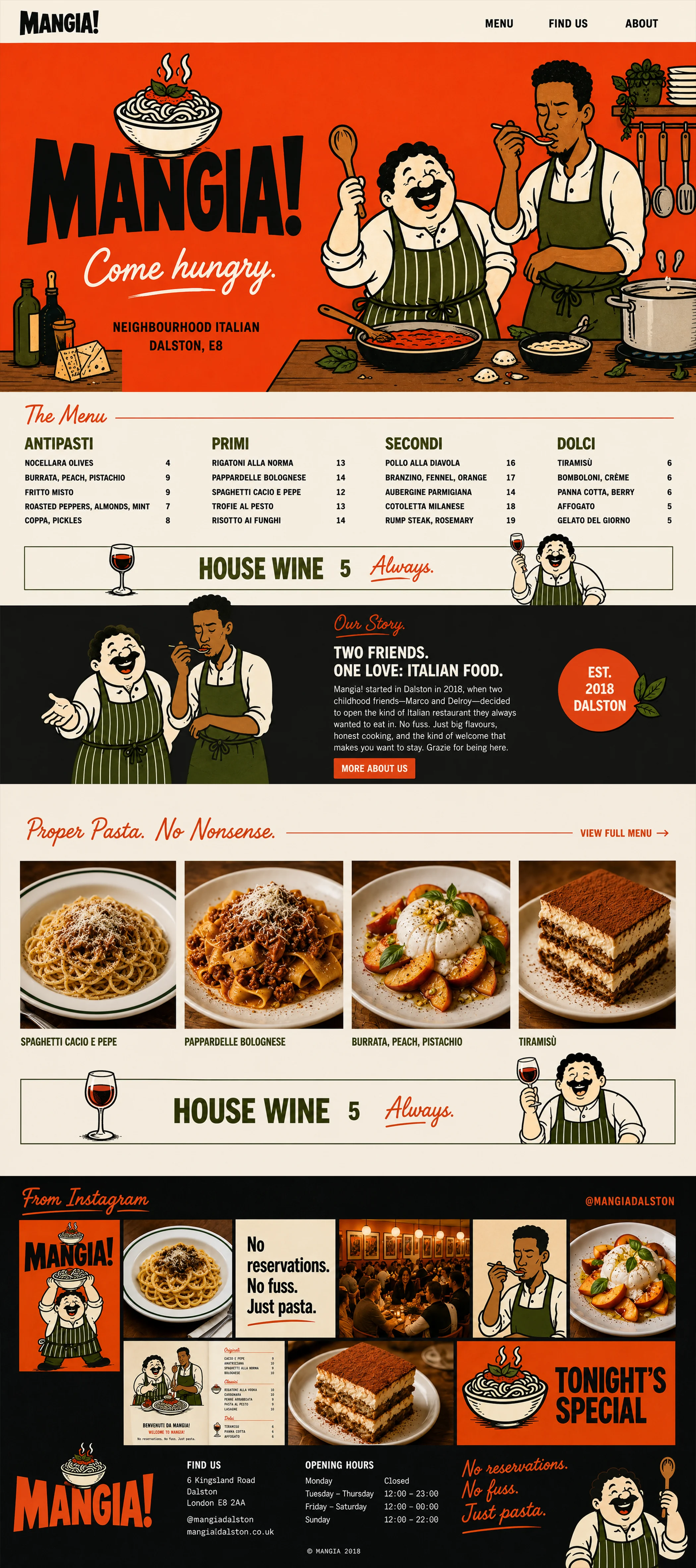
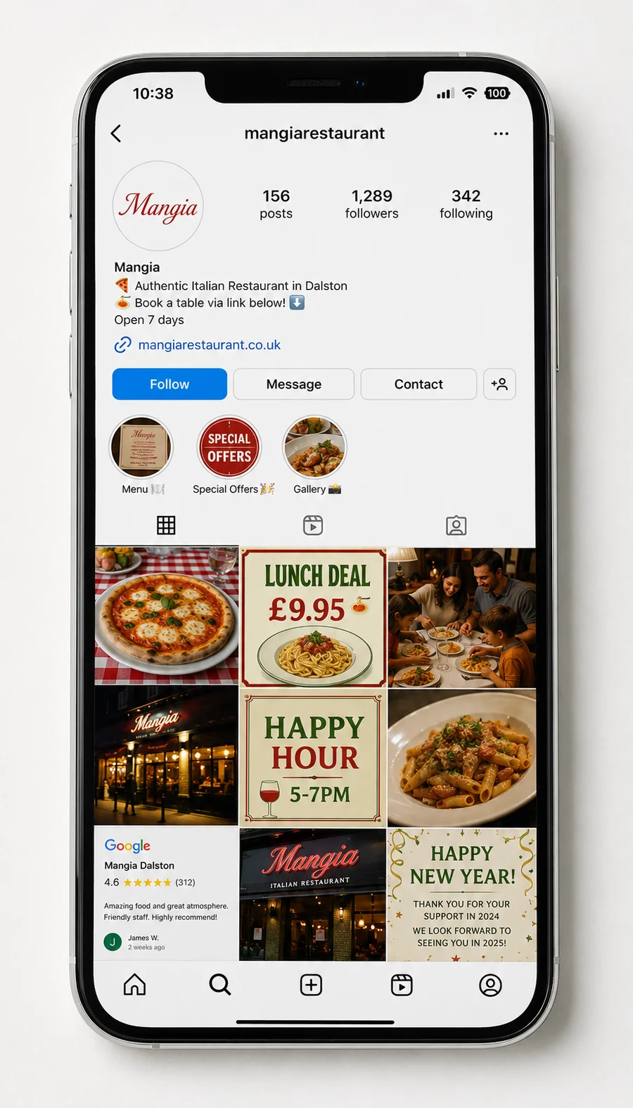
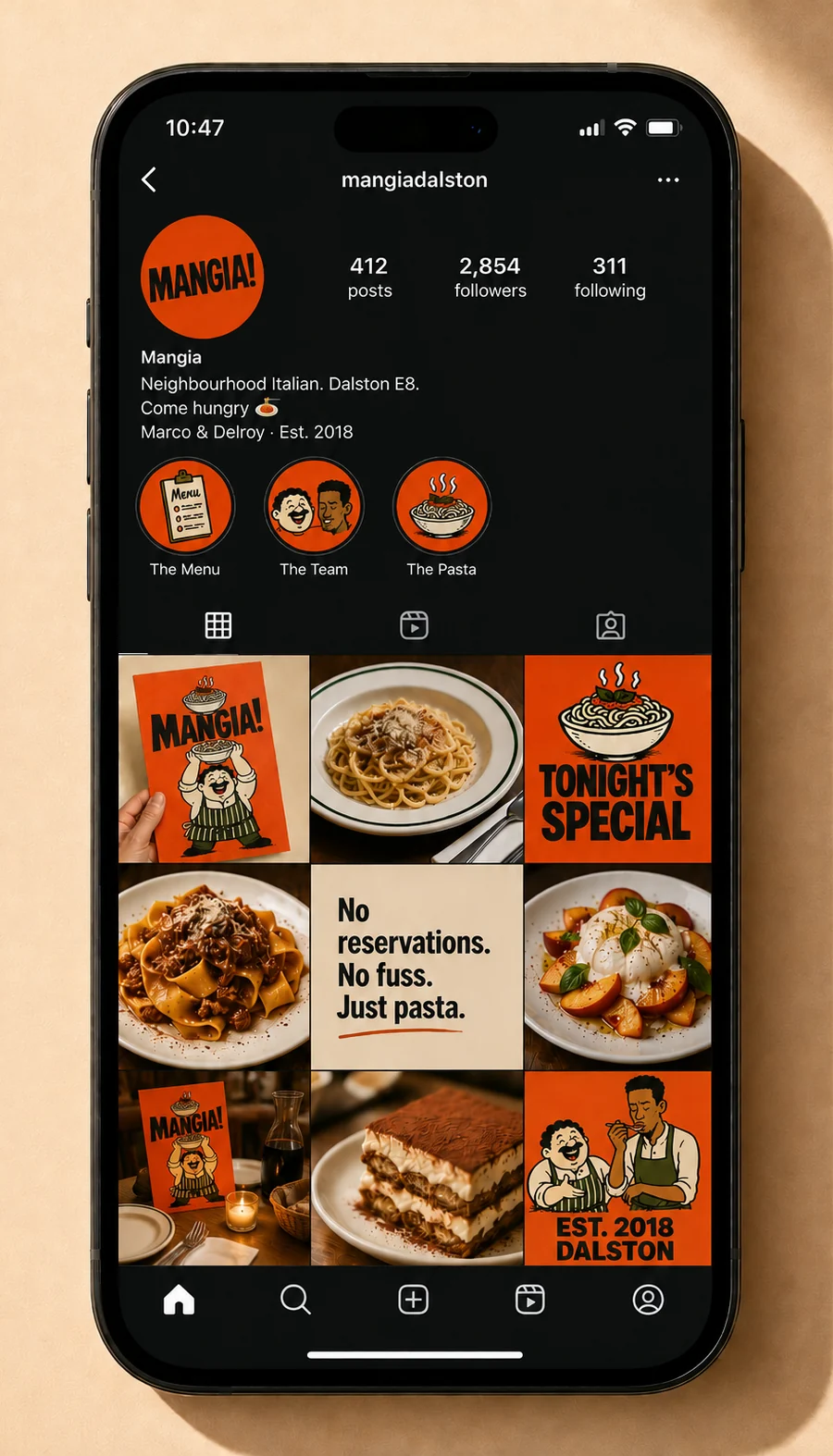
The grid is where a small brand is judged most often, and where the change is hardest to deny. Same kitchen, same cadence: a different idea of who is walking in.
Somewhere, your business is still reading off the old menu.
This page has been honest about being a concept, so be honest about this: if your customers saw your work the way you see it, your prices would be higher. They aren't yet. That gap has a name, and an audit.